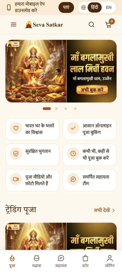
DESIGN 1
Aaj ka Tithi
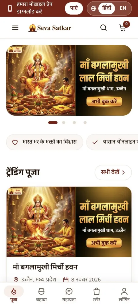
Warm cream with saffron accents and elegant Hindi headings. Calm, airy and traditional.
Open design
Five design directions for the new Seva Satkar homepage. Each follows the same sections as the current website and is designed for mobile first. Open any design on your phone to try it, and switch between हिंदी and English at the top.
Warm cream with saffron accents and elegant Hindi headings. Calm, airy and traditional.
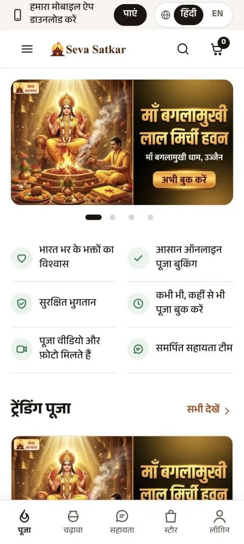
Open designBright white with rounded, friendly shapes and maroon buttons. The simplest to use.
Open designMinimal and premium. Lots of white space, dark text and fine lines that build trust.
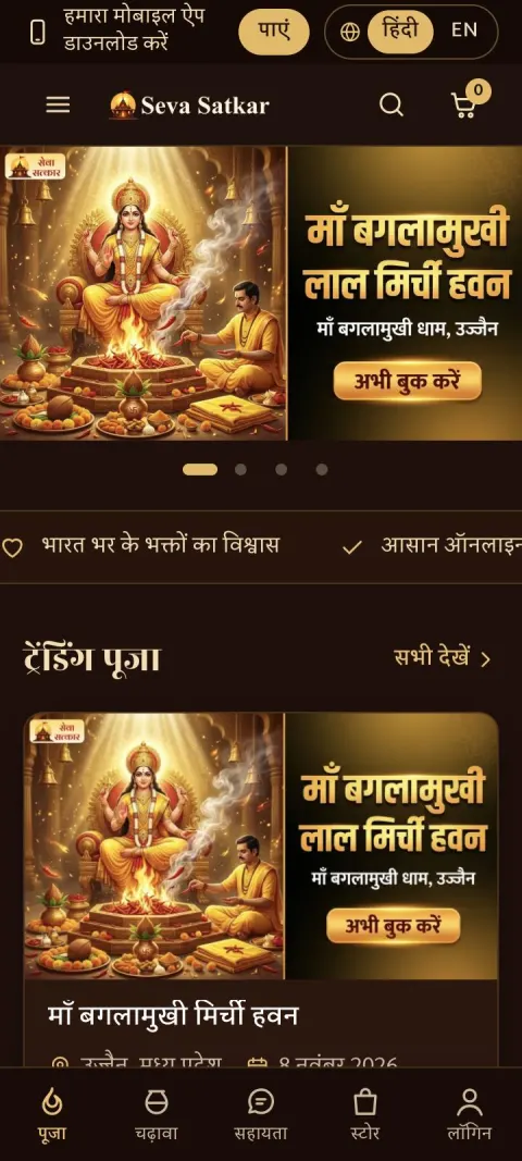
Open designRich dark maroon and gold with large temple imagery. Devotional and festive, still easy to read.
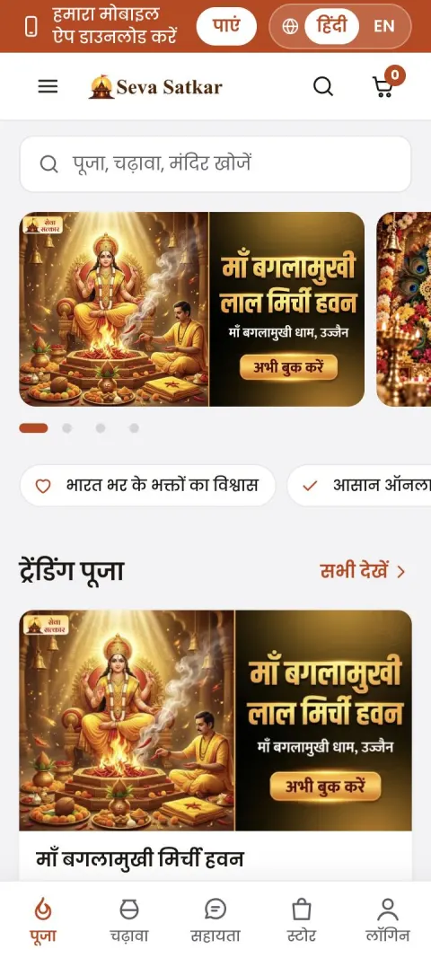
Open designFeels like a shopping app. Crisp white cards on light grey, with a search bar always in reach.
Open designThese are design previews with sample content. Buttons and links are not active yet.